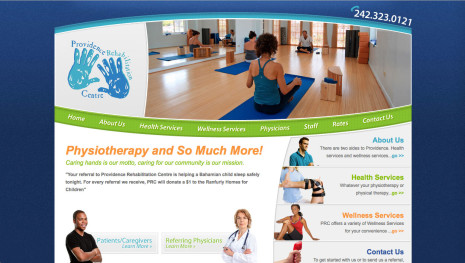
Providence Rehab
A website for a physiotherapy business in the Bahamas
Project Info:
Providence Rehab’s website was an interesting one. The client had a clear cut idea of what she wanted to do with the marketing message. However, I’ll never forget her design directive… “I want it to have Dr. Seuss colors”. The final product is a cross between a well thought out marketing concept married with a playful look.


